...the ongoing challenge to stay one step ahead of the game!
Already two months into the year and we’re starting to see this year’s predicted design trends filtering their way through to the web.
Below is a list of our favourite top ten:
1. BIG Typography
Whoever said size doesn’t matter was very much mistaken! Last year saw a size explosion that is continuing through to 2009. Large typography is still being used to communicate the most important messages on the web… no longer are we restricted to using point size 11! Attention to detail – leading, kerning, choice of font and positioning, to name a few, is vital. The results: typography is an ever-growing key factor in the production of creative, modern web design.
2. White Space
Another trend that continues from 2008… the use of white space. This allows for clean, crisp and minimal web designs and improves the general flow and structure of sites, especially for text heavy designs. News and blog sites are a classic example of this. Padding of 20 to 25 pixels is becoming rule of thumb, although more is often considered acceptable.
3. Magazine Look
Going hand in hand with white space, is the traditional magazine look. Designers are bringing traditional print media to the web, using typography and illustration to replicate. Multi-column layouts (3+) are a fundamental part of this design trend, and given the increasing levels of information-rich content online, the traditional magazine look is already familiar from our offline reading experience and provides a simple way to organise large amounts of content. But beware! Careful consideration needs to be given to increasing and widening screen resolutions with this design trend.
4. Media Blocks
Advances in broadband and Internet access has meant that more media can be screened in dedicated blocks on a website – namely video streaming. Whether this be news, videos, step by step guides or presentations, the user can quickly and effectively consume information with little effort. This advance in technology ultimately allows for added creativity and the continual fight to find the next best creative solution continues.
5. Carousels
2008 saw an explosion of carousels and slideshows flying around the Internet and is continuing into this year. In summary, the carousel is a quick navigation that is very easy to use. Ultimately it allows the user to browse content without having to search through a multitude of pages for what they are looking for. However, there is a strong argument that carousels are overkill, that said, they offer a familiar user experience given their now widespread usage. We look forward to seeing more innovation around the classic carousel.
6. Web Apps
This is the year of the Web Application. These are appearing increasingly frequently and with more creative, user-friendly interfaces; gone are the days of pure techie web apps. Design trends include the use of white space (again!), padding (again!) and key is the attention paid to the presentation of functionality. Web apps are increasingly acting as a gateway page to a brand’s social media presence and with the increasing proliferation of mash-ups, are now also contributing to the design and functionality of websites themselves.
7. Social Icons
As most of you would have already seen, social icons are everywhere! These encourage the user to click through to social media sites – promoting, following and recognising web authors, especially in the blogosphere. And it seems the bigger and the more attractive, the better! A great way to spread the word on your content, social icons not only make your site look up-to-date, but contribute to increased web traffic also. Ones to watch include TweetMeMe, social shopping sites and wish lists.
8. Large, larger and larger still!
As with typography, it seems that massive, vibrant graphics are beginning to dominate web design too. More space is being dedicated to these visuals – whether it be in headers, backgrounds or basic design assets - which in turn is capturing the user’s attention (many ‘ohhs’ and ‘ahhs’ coming out from the design team I can tell you!) To add to this, large search boxes are still popular, with designers ever pushing the boundaries of what can and can’t be done with these functional web assets.
9. Graphical Approaches
So creative, vibrant graphics and illustration are big in 2009, but what styles and are actually being implemented? Well, what goes around always comes back round again sooner or later. Grunge is back, the use of organic textures, tiles and photographic backgrounds, price tags, badges, watercolour, ribbons and handwriting to name a few!
10. Lightboxes
As the ‘second generation of pop-ups’, a light box highlights key areas of a site by appearing as an independent modal window that sits on top of main content. It is incredibly user friendly and fast becoming a reoccurring feature on many sites. As always, presentation and functionality are key – with designs including transparencies, drop shadows, ‘close’ ‘next’ and ‘previous’ buttons.
So that’s it! Our faves from the emerging web design trends of 2009. We’re seeing rapid change in trends so we’ll be updating you again in a few months with the most up to date design trends – watch this space!
Natalie
Lead Designer
Showing posts with label website design. Show all posts
Showing posts with label website design. Show all posts
Thursday, 5 March 2009
Thursday, 8 January 2009
Web Design for Children
One of the brilliant things about the web is that it really is for everyone, and that includes people of all ages.
Most parents at some point experience the feeling of amazement when they see just how easily and well their children are able to interact with technology – this is often also accompanied by (quite valid) feelings of fear and trepidation. What makes children so good with technology is the fantastic ability to learn and that keenness to explore. Many companies want to take steps to service and interact with the youngest sections of the population – but exactly what does that entail?
Ethics
The most important thing to consider at the outset of any project involving children is the ethics of it, especially online. It is key to ensure the project can never have a negative effect on the children using the service – aside from the ethics; it wouldn’t bode well for brand reputation! Consideration has to be given across a whole range of issues, from the type of information available to any communication between the users and owners, or indeed between the users themselves. This can be achieved by ensuring that stringent checks are made at all levels, providing additional tools to administrators, creating additional information content for parents/teachers and utilizing legal teams to ensure compliance with all relevant laws. Security is an important consideration for any web site; when they involve children in some way, even more care should be implemented and certainly no shortcuts can be taken.
For older children, sites can start to include more sophisticated (in comparison to parent supported users) user features such as allowing the users to earn points and compare themselves with other users, or directly interact with each other. Ethical guidelines should of course still be applied at this user level and enhanced security must still be applied here. Older children may have more experience, but they are still vulnerable and it is critical to ensure that children of any age do not have a negative experience or get exposed to potential dangers when using the website.
User Experience (UX) - take nothing for granted
When it comes to the design, a great deal of consideration has to be given to just how children will be interacting with it, for very young children this may be the first website that they use. This means that nothing can be assumed about the user’s knowledge, when areas like navigation are considered this becomes very apparent. It can generally be assumed that with an average user, they will look for a menu system in order to navigate the site, with younger children this cannot be taken for granted, so the design and functionality of the site must ensure that the website takes the user on an easy to follow visual journey.
Engagement - don't forget the parent!
Often websites for very young children will aim not to be used by the child alone, but assisted by a parent. With these sites it is equally important to consider the engagement of adult users, and ensure that the process is interesting, not excessively repetitive, of educational value and of interest to the child, so that the adults feel happy to use the website with their child many times. Features such as repetitive music that a child may be totally happy with for hours on end, may make a parent yearn for ear plugs after just a few minutes!
Education, education, education
Websites for children also have a responsibility to be educational and even at very basic levels, it must be remembered that any information on the website might be the user’s first experience of the subject. This responsibility must always be taken seriously, and wherever there are recommended standards, the appropriate groups and organisations should be contacted for additional information.
Websites such as CEOP and Kidsmart are good places to start research. Documents such as the CEOP Charter are produced so that consistent approach and standards are used. It must also be borne in mind that the website may well become a reference for children that they will use frequently. In which case, it is important to ensure that information is accurate and kept up to date.
Ensure it's useful
Information should also be useful – both to parents and children – either for having fun or achieving practical goals. Parents will be especially keen on sites that encourage the child to be creative, communicate, learn and question. By presenting information that gives a parent a way of re-enforcing and supporting the life lessons they are trying to educate their children with, the parents will be much more receptive to the brand being presented. This information could also take the form of content that parents can download. Some great examples of this are downloadable party invitations, Christmas cards, colouring and drawing exercises. Again this interaction with both the child and the parent helps to encourage frequent use and great brand awareness.
A great many websites interact with younger users very successfully, improving their status within the community and helping to contribute in a positive way to the education and development of children all over the world.
Whilst website projects with children have to be approached with great care, they result in very positive experiences for everyone involved – being involved with a project that makes a real contribution to the happiness, education and development of children is a highly rewarding experience for all involved.
David C
Programmer
Thursday, 13 November 2008
How Do We Get Digital to the ‘Top Table’?
There’s nothing more powerful than demonstrating real ROI to the top table. Online is the most effective comms channel for doing this, because it is so inherently measurable. Our problem is that most senior level marketers are from a traditional marketing background and can have a tendency to stick to what they know.
Digital agencies need to be more vocal about the tangible impact they can have commercially.
It will get noticed.
When you eventually get to the top table, don’t waste the opportunity. Don’t be afraid of driving the agenda. After all, a good idea is a good idea.
It’s not about digital vs ATL. It’s not about blind integration. It’s about advising clients how best to engage with the consumer and the commercial benefits this will bring.
Michael B
Senior Account Director
Tuesday, 30 September 2008
Highlight and Lowlights: The Importance of Looking in the Mirror.
Every company has to frequently look in on itself to work out where things are going wrong, and how it can improve. In the internet industry this has to be done with a greater frequency and with a lot more care. At Bluhalo our job changes all the time – almost weekly new technology and new examples of websites appear – every one of them something that clients will next week be asking for.
One of the biggest challenges we face is working out how we can do better next week than we did last week – and making it stick. In such a changing industry it is inevitable that mistakes are made – and equally inevitable that fantastic solutions are found. Whenever problems occur the team at Bluhalo always works quickly to fix things – but the work does not stop there. Taking these lowlight experiences, the team works out why and how things went wrong and converts this into procedures to protect clients against the same things happening again.
But what about the highlights? Not every company takes notice of these – but they are just as important as the lowlights, if not more so. The highlights on every project are treated just the same as any lowlights. The team at Bluhalo makes sure that successful ideas are noted down with every project and translated into procedures that are used and applied on new projects. It is this recognition and repetition of the good bits that some companies choose not to concentrate on. And is just one of the many things that makes Bluhalo a fantastic agency to work for and gives clients an experience based upon a wealth of experience.
David C
Thursday, 11 September 2008
Sports Website Design
It's all about engaging fans.
We know sport, we’re fans ourselves. We know how fans think, what they want, why and how; and when we’re not a fan, we become one. We get inside the minds of fans and we work out exactly what makes them tick.
We don’t just design a website to how we think it should look, and we don’t just design a website that follows the crowd, we design a website that sets you apart from the crowd, encapsulates the essence of your brand and most importantly, excites your fans.
Exciting your fans isn’t just about giving them a website that has that ‘wow’ factor, although that’s important too, of course. It’s also about giving them the basics that they are going to need, such as real-time results, updates and news. The ‘wow’ factor obviously helps and gives them something to talk about too. But there also needs to be more depth, things to keep them coming back, we don’t only give you a way to talk to your fans, we give you a way to interact with your fans.
Fan interaction is great. They love you, they want to be associated with you and they really want to be listened to by you. By creating ways for the fans to interact, not only do we get you even more fan-love, but we also get you a great resource for research, feedback and the halo effect – they’ll spread the love. We give them a place to belong, a place of passion and community.
But it’s not all about cool features, communities and the latest downloads. There’s also a bit of theory behind the way we do a great job at engaging the fans via your website. We focus on user experience - a clear layout, intuitive navigation and compelling calls to action; we ensure you are accessible – after all, up to one in five visitors to your site will have some form of disability; we keep it simple – the less clicks to where they want to go the better; the list of what we do is pretty long, but the long and the short of it is – we help our clients engage their fans and we do a good job of it too. Which is why we are the agency of choice for the UK sporting sector.
You can check out some of the sports websites we've created by visiting our clients page.
Wednesday, 20 August 2008
Digital Agency Love
We love our clients. Not just because they pay our wages, but because we feel a part of their business. We want to see their successes as a result of our input. So how do we go about this?
We make sure that we go that extra mile to not only deliver a good project but to deliver a brilliant project.
We wanted to let the world know how we do this, so we did a quick Q+A with our team and came up with some of the things we’ve done for our clients recently:
We make sure that we go that extra mile to not only deliver a good project but to deliver a brilliant project.
We wanted to let the world know how we do this, so we did a quick Q+A with our team and came up with some of the things we’ve done for our clients recently:
- Checking client entered CMS content before launch to make sure it looks perfect
- Giving advice from best practice website product photography through to the direction of online businesses
- Writing various ‘how to’ guides including using a CMS and email marketing best practice
- Working out of hours to help client by delivering project stages early
- Continually pushing creative and technical boundaries to deliver best of breed sites
- Account Director input and advice at all stages of development
- Taking client calls at the weekend, in the evening and even the middle of the night!
These are just a few of the many things that we came up with. But, by far the most mentioned was working out of hours… be it to ensure a timely delivery, to deliver additional features, or to make sure client content looks just right. Members of our team consistently spend their own time making sure what we deliver is both creatively and technically brilliant.
Monday, 28 July 2008
Mobile websites - time to get commercial
Mobile web is experiencing a new buzz, but this time brands are really acting on it.
It wasn’t so long ago that everyone was talking about the mobile web revolution, it would change the world. But then talk of the phenomenon appeared to subside and things went quiet. Was this the end of the mobile site boom before it even really began?
Certainly not. I’m more inclined to call it the lull before the storm. In recent months the pages of NMA have been full with stories of newly launched mobile sites and increasingly ingenious uses of mobile technologies in commercial applications. And it’s their commerciality that is the key. It’s not about who has the coolest looking mobile site, but it’s about actually being able to use the site to achieve a goal or satisfy a purpose.
And it’s exactly the lack of this commercial element that has held back the mobile boom until recently. The penetration of mobile internet has reached 12.9% in the UK (source NMA, July 08), now providing a significant enough audience to make mobile sites really work.
So, the excitement of the new mobile boom is now upon us. Brands are taking the leap, investing in mobile and they have a real use for their mobile sites, rather than just ‘being there’.
Some of the most recently launched / soon to be launched mobile sites include:
- Real Madrid – launched July 08 the main purpose of this site is to provide downloadable content and official club news
- Trinity Mirror – due to come this autumn - 12 new mobile sites for its brands including the Daily Mail
- Itchy Group (they do the Itchy City Guides) – a site and SMS service that will allow users to find their June 08 and includes the latest news, ticket information and features a host of downloads
- Kellogg’s – used a mobile site as part of their ‘Win a zookeeper experience’ campaign launched early 2008
These are just a few of the mobile sites that have launched recently. There are a host of sites supporting some of the UK’s best known on and offline brands including:
- BBC – http://www.bbc.co.uk/
- Google – http://www.google.co.uk/
- Flickr – m.flickr.com
- National Rail – wap.nationalrail.co.uk
- Facebook – m.facebook.com
If you’re thinking about using mobile to benefit your business, give us a call on 01252 70 11 11 to find out how we could make it work for you.
Jocelyn Kirby
Thursday, 26 June 2008
Open Source vs Library vs Ad Hoc
Depending on your requirements, there are different approaches that may be taken in creating a website. What are they (lets pretend you haven’t already read the title)? What advantages do they bring? What do we at Bluhalo advocate?
The first one we will consider is open source software. Although there are a number of different licence flavours, at its most basic open source software can be thought of as free code. What this code does depends entirely on the type of software. For example, there are entire ecommerce solutions available that can be installed and simply require customisation to use. At the other end of the open source spectrum (that we are interested in) would be simple components, intended to achieve a very specific purpose. Somewhere in the middle is the concept of frameworks – varying quantities of code designed to facilitate ad hoc development (more on that later).
So why would you go the open source route? Assuming you can find something that meets your needs, speed of development is greatly increased. Also, if the community for the project is active, it has likely been well tested, meaning there should be very few bugs. The flip side of this is that if there is little community interest or input, projects can stagnate and die - what may initially appear to be a great solution ends up requiring far more time to correct than anticipated, and since it requires working on existing code it potentially forces the developer to work in a way that might not best match their work flow.
To get over the last point, you come to the possibility of building and maintaining a library of your own code. While it can take time to accumulate a meaningful library, it will be code that you know intimately so should be fully aware of what it is capable of. Rigorous testing would also allow you to overcome the lack of a community in ensuring that it is stable and reliable. Precisely what you maintain is very much down to personal preference – some prefer it to be a number of often used functions, while others may prefer to create extensive frameworks for different types of project that can easily be rolled out at need.
The problem with the latter (and with the larger open source solutions) is that they don’t always precisely match requirements – there may be redundant code or features, or they simply may not provide functionality required by the client. Here we come to ad hoc development – crafting a web application precisely according to the needs of the client. While this is more time consuming, it does mean that the final solution will more exactly match what was requested.
As with everything in life, there are advantages and disadvantages to each. If only we could pick and choose! So how is it done at Bluhalo? Here we can give a knowing and reassuring smile. :) We aren’t locked into any one practise.
For example, a smaller business in need of an ecommerce solution with a limited budget will be pointed toward our Dreams division. In this case, they will carefully customise an open source solution with which they are intimately familiar (i.e. tried and tested!) to give the client the best possible balance for their needs.
We also use an open source framework, Symfony, that is gaining a large following around the world. As I mentioned earlier, a framework is designed to aid development – it prevents the programmers from having to re-invent the wheel on every site and instead allows them to concentrate on the nuts and bolts of what makes the clients’ site unique. This has a hugely positive affect on the time it takes to develop a proprietary site.
We also maintain a code library - if a client wanted a simple mp3 player (yay, finally a multimedia example!), we would start with our library player. This is an existing basic player that I wrote previously, and then adjust it functionally and visually to precisely meet the clients requirements. Why waste their valuable studio time unnecessarily?
Basically then, we don’t fall into the trap of relying on a single practice and forcing it around the requirements we are given. The needs for each site will be unique, so we adjust our methodology according to what will give you the best result.
Nick
Thursday, 12 June 2008
Creative Blocks
Mental blocks. We all get them sometimes. Whether you’re trying to figure out where you put the keys last night after a night out on the beers or whether you are trying to write a pitch for new business. In the creative team we get them occasionally... trying to be creative 24/7 hurts the brain sometimes! So we like to call these creative blocks. How do we get over these? Stepping out of the office for an hour might help. Others like to listen to music. Or a mass brainstorming session. But more often than not finding inspiration from graphic artists help. It’s not always other sites that you have to turn to in order to design a great site. A simple burst of colour or a sweeping curve may help to explore new ideas and even the smallest of things will have a big effect on what direction to take next.
So we have selected pieces of work that have inspired us from time to time and helped get us over that creative block. Click on an the artists name to get their portfolio, you may even recognise some of their work!
Enjoy...
Si Scott (London, UK)


Radim Malinic (UK)


Peter Jaworowski (Warsaw, Poland)

So we have selected pieces of work that have inspired us from time to time and helped get us over that creative block. Click on an the artists name to get their portfolio, you may even recognise some of their work!
Enjoy...
Si Scott (London, UK)

Radim Malinic (UK)


Peter Jaworowski (Warsaw, Poland)


Ben Bush
Monday, 12 May 2008
Client Focus - Hi-Tec Microsite
Recently launched in March is the new website for Hi-Tec, www.hi-tec.com/ion-mask -promoting the new groundbreaking technology of ion-mask™.
The website has been designed to deliver a dynamic and enticing experience and provides a stylish and innovative platform from which to communicate the revolutionary nature of the ion-mask technology. The website will form the core of an online campaign launching the Hi-Tec ion-mask™ footwear range.
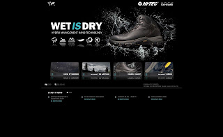
Hi-Tec ion-mask™ homepage.

Hi-Tec ion-mask™ in action.
Hi-Tec ion-mask™ news.
The Hi-Tec ion-mask™ footwear range represents a quantum leap in footwear technology and has already created a stir within the industry. A breakthrough in surface enhancement, the ion-mask™ process - developed by P2i Ltd - works at a molecular level binding invisibly to the surface of the shoes giving them an extraordinary ability to repel most liquids. With the technology allowing for a lighter, cleaner, more breathable and environmentally friendly product, Hi-Tec is already taking the outdoor market by storm with record orders.
Representing possibly one of the biggest technology launches the industry has seen, the website will present visitors with animated information on the benefits of ion-mask™ and includes a show reel, press stories and a blog written by Hi-Tec, which will communicate latest news, personal opinion and brand messages, whilst encouraging consumer interaction and brand engagement.
Michael Brandreth, Senior Account Director at Bluhalo, says ‘Hi Tec briefed us to produce a site that not only communicates the fantastic consumer benefits of ion-mask™ but that also helps self-generate its own traffic. As part of a phased launch, we will introduce social media techniques to the site that will compliment the existing content and help drive awareness levels’.
Jason Larke, Group Brand Communications Manager at HI-TEC, says ‘ion-mask™ is a truly revolutionary technology in every sense and HI-TEC has been at the forefront of its development. The applications of the technology are immense matched only in its ability to capture attention. It’s just that cool! After a lengthy process we felt that Bluhalo was best equipped to not only deliver a dynamic and functional site but also to provide the backbone for communicating to a wider audience through a fully integrated social media strategy.’
The website has been designed to deliver a dynamic and enticing experience and provides a stylish and innovative platform from which to communicate the revolutionary nature of the ion-mask technology. The website will form the core of an online campaign launching the Hi-Tec ion-mask™ footwear range.

Hi-Tec ion-mask™ homepage.

Hi-Tec ion-mask™ in action.

Hi-Tec ion-mask™ news.
The Hi-Tec ion-mask™ footwear range represents a quantum leap in footwear technology and has already created a stir within the industry. A breakthrough in surface enhancement, the ion-mask™ process - developed by P2i Ltd - works at a molecular level binding invisibly to the surface of the shoes giving them an extraordinary ability to repel most liquids. With the technology allowing for a lighter, cleaner, more breathable and environmentally friendly product, Hi-Tec is already taking the outdoor market by storm with record orders.
Representing possibly one of the biggest technology launches the industry has seen, the website will present visitors with animated information on the benefits of ion-mask™ and includes a show reel, press stories and a blog written by Hi-Tec, which will communicate latest news, personal opinion and brand messages, whilst encouraging consumer interaction and brand engagement.
Michael Brandreth, Senior Account Director at Bluhalo, says ‘Hi Tec briefed us to produce a site that not only communicates the fantastic consumer benefits of ion-mask™ but that also helps self-generate its own traffic. As part of a phased launch, we will introduce social media techniques to the site that will compliment the existing content and help drive awareness levels’.
Jason Larke, Group Brand Communications Manager at HI-TEC, says ‘ion-mask™ is a truly revolutionary technology in every sense and HI-TEC has been at the forefront of its development. The applications of the technology are immense matched only in its ability to capture attention. It’s just that cool! After a lengthy process we felt that Bluhalo was best equipped to not only deliver a dynamic and functional site but also to provide the backbone for communicating to a wider audience through a fully integrated social media strategy.’
Monday, 28 April 2008
Mr. Fothergill's Press Coverage
News of our recent launch of Mr. Fothergill's new ecommerce website was featured in Catalogue e-business today. For more information, view our client case study.
Here's a copy of the article:

Click the image for a larger view.
Here's a copy of the article:

Click the image for a larger view.
Thursday, 17 April 2008
ShortList Press Coverage
It seems that the press is in our favour today with a second mention of Bluhalo in this week's New Media Age. The article is an interesting and humourous insight into the agency selection process embarked upon by Phil Hilton of ShortList. It concludes with the rationale behind Phil's choice of agency;

"We opted for Bluhalo, which seems plugged into every new forum and social-networking trend on the planet, has a clear and honest approach to time management, and a light and airy office in Farnborough. They will lead and I will sit quiety munching the Choco Liebniz."
Here's a copy of the full article:

Tuesday, 8 April 2008
Hi-Tec ion-mask website launches
Bluhalo is pleased to announce the launch of a new website for Hi-Tec, www.hi-tec.com/ion-mask - promoting the new groundbreaking technology of ion-mask™.
The website, designed to deliver a dynamic and enticing experience and providing a stylish and innovative platform from which to communicate the revolutionary nature of the ion-mask technology, will form the core of an online campaign launching the Hi-Tec ion-mask™ footwear range.
The Hi-Tec ion-mask™ footwear range represents a quantum leap in footwear technology and has already created a stir within the industry. A breakthrough in surface enhancement, the ion-mask™ process - developed by P2i Ltd - works at a molecular level binding invisibly to the surface of the shoes giving them an extraordinary ability to repel most liquids. With the technology allowing for a lighter, cleaner, more breathable and environmentally friendly product, Hi-Tec is already taking the outdoor market by storm with record orders.
Representing possibly one of the biggest technology launches the industry has seen, the website will present visitors with animated information on the benefits of ion-mask™ and includes a show reel, press stories and a blog written by Hi-Tec, which will communicate latest news, personal opinion and brand messages, whilst encouraging consumer interaction and brand engagement.
Michael Brandreth, Senior Account Director at Bluhalo, says ‘Hi Tec briefed us to produce a site that not only communicates the fantastic consumer benefits of ion-mask™ but that also helps self-generate its own traffic. As part of a phased launch, we will introduce social media techniques to the site that will compliment the existing content and help drive awareness levels’.
Jason Larke, Group Brand Communications Manager at HI-TEC, says ‘ion-mask™ is a truly revolutionary technology in every sense and HI-TEC has been at the forefront of its development. The applications of the technology are immense matched only in its ability to capture attention. It’s just that cool! After a lengthy process we felt that Bluhalo was best equipped to not only deliver a dynamic and functional site but also to provide the backbone for communicating to a wider audience through a fully integrated social media strategy.’
Thursday, 3 April 2008
The HOT 5 design trends for the year ahead
1. User Generated Content (UGC)
Fuelled by the rapid growth of web 2.0 and social media, UGC is becoming an essential part of website design, with an increasing amount of website real estate being allocated to UGC features. From blogs, videos and podcasts to comments, articles, tag clouds and much more, UGC is becoming as important in web design as calls to action and clear navigation.
2. Functional or Fat Footers
Below the fold is becoming as important as above the fold, a functional footer is often seen as just another way of increasing clicks within your website from the lower parts of your website. But it’s more than that. A functional footer improves usability, is simple to build, is very en vogue and provides a high density of key words to contribute to your SEO.
3. Rich Email Marketing Campaigns
Cited as the new DM, email marketing has grown hugely in popularity in recent years. With increasingly sophisticated broadcast software, detailed tracking and virtually limitless options for the creative, email marketing is a fantastic way to increase your top of mind awareness, encourage repeat purchase and provide a means for you to promote special offers, new products and communicate your latest news.
4. UX – User Experience
With website usability a key factor in the success of a website, clear navigation is essential in ensuring a site is a pleasure rather than a chore to explore. With UGC, web 2.0 and social media all contributing to vast amounts of content within sites, it’s all the more important to make sure you make it simple and easy for your visitors to find what they’re looking for. This might be with the use of ‘speaking’ navigation or icons to add meaning to the traditional ‘one-word’ navigation, both of which have the advantage of looking pretty cool too!
5. Site Personalisation – Back with a vengeance…
Personalisation has been around for years, but as users are becoming increasingly sophisticated in their use of the internet, it’s back with a vengeance. With users now used to and taking enjoyment from creating their own web pages, such as with MySpace and Facebook, the ability to personalise a site is frequently becoming a big selling point of a website. By enabling your users to personalise your website by choosing what items they see, such as topic specific news, blog articles, specific product groups or even simply the colour scheme of your website, you’ll increase the depth of brand engagement, improve repeat visits and ultimately increase conversions.
To continue with our marathon of web tips, click on one of the article titles below:
Make social media work for you
Increase your website traffic
Blog successfully
Must-have website features
Monday, 31 March 2008
Mr Fothergill's Ecommerce Site Launches
We're delighted to announce the launch of a new ecommerce website for Mr. Fothergill’s Seeds Ltd!
Mr. Fothergill’s is one of the county’s most respected suppliers of seeds and gardening products, supplying retailers, international markets and direct to the consumer.
The new website provides Mr. Fothergill’s with an online outlet for their seed, plant and gardening related products, which range from vegetable seeds and flower plants, through to bird scaring tape and soil PH tester kits.
The website, designed to communicate the unique personality of the well-known brand, presents a large range of products in an easy to navigate and cleanly designed website.
The site is content managed, including full product and promotion management, to enable the company to easily add, update and amend product listings. The site is integrated into the company’s mail order system, streamlining the online purchasing process and also provides a full email system, enabling Mr. Fothergill’s to be entirely autonomous in its website and email management.
The new website can be viewed at www.mr-fothergills.co.uk or you can view our client case study here.
Wednesday, 19 March 2008
Cut Spend - Damage the Brand
It's one of the most talked about areas in the marketing world this week - the debate about whether cutting marketing spend during an economic slowdown can damage the brand. Fuelling the debate is a recently released report from the IPA (Institute of Practitioners in Advertising) which warned that cutting budgets during a downturn could damage the brand in a number of ways including loss of market share, a long term effect on sales and a decline in brand image.
So, how does this apply to your website? At a time when budgets are being carefully monitored, if not reduced, there arises an opportunity to gain some ground on your competitors and even extend your lead in your marketplace. When the majority cut budgets, keep on spending, even increase spending if you can get away with it! Invest in a **** hot website, take two leaps ahead in terms of style and technology - then use it!
It's all part of the bigger picture, but with internet usage continuing to grow and the social media phenomenon making even the most tech-shy marketers sit up and take note, a time when your competitors are being over-cautious is the perfect time to stand out from the crowd!
A great website can create increased brand loyalty, encourage interaction between your brand and its public and most importantly help to drive sales - whether they're online or offline. Strengthening your offering at a time when caution is the norm will give you the stability to ride out the hard times and more importantly, will give you a long term competitive advantage. In addition to these marketing benefits, clever use of technology within your website can also help to streamline internal processes, actually saving you money!
Whether you are B2B or B2C, if you want to find out more about how a new / updated website can help your business get ahead of the game, start by speaking to Bluhalo.
Saturday, 23 February 2008
It’s a job for grown-ups
By Mike Southon - Financial Times on Saturday 23rd February 2008.
Read the article below, which followed on from a recent interview with Spencer Gallagher the Founder and Managing Director of Bluhalo
There is also a Podcast of the full interview (and a cut down version) which can be download from The Beer Mat Entrepreneur Website http://www.beermat.biz/ or through iTunes
"It is hard starting a new business. It is even harder growing it, as this requires the entrepreneur to hire people better than themselves. Anyone starting a business has to be versatile.
They have to have enough sales ability to secure customers. Then they have to be able to deliver on their promises, which often involves working long hours. Finally, they have to do their own finances and try to avoid going broke from poor cash flow.
All this can be very hard work and explains why a large number of businesses cease trading in the first year. But if you are successful, you can then start scaling up your business. The problem is that there is a glass ceiling of somewhere between 25 and 40 people.
To grow above this level you need to plan carefully and put some proper business processes in place. Process is the natural enemy of the entrepreneur, so the clever ones hire professionals (or grown-ups as I like to call them), who can do some relatively simple tasks in a systematic and repeatable way.
One such entrepreneur is Spencer Gallagher, who stumbled into web design after a career in clothing retail. He had early success with his company Bluhalo doing simple websites for start-up businesses. His bright idea was to trawl the database at Companies House for newly-registered businesses and offer them a quick service to get up and running.
Business was good and he was able to expand, so Gallagher realised it was time to hire people better than himself to do the jobs he hated the most. Top of the list was finance. Most entrepreneurs have a bookkeeper or an accountant, but these people can only deal with the past. What is required is someone who looks into the future, or a finance cornerstone as we call them in our Beermat model.
This is someone who tells you months in advance that you need to do certain things differently. It is often assumed these people are just there to control costs. This is the easiest part of their job. What they are really there for is to work out how to scale the business, which should involve getting involved in every part of the operation. Some finance cornerstones even make great sales managers.
Gallagher approached finding a finance cornerstone in exactly the right way. It had to be someone whom he liked, who understood the direction he wanted to take Bluhalo. He then told this person they had to pay their way as soon as possible. Reducing unnecessary costs can make finance cornerstones unpopular.
The natural mode of the entrepreneur is to say “yes” to staff, which can lead to a lax regime for personal expenses. It is very common for a new finance cornerstone to attract the nickname Dr No, but increased awareness of the need to control costs is a natural part of the growing-up process for any small company.
The next “grown-up” that Gallagher hired was an experienced project manager from IBM. Small companies usually deliver projects by the seat of their pants. This works for small number of customers, but scaling this up is very hard. It requires skills that can only be gained from the successful delivery of large projects and these skills are most often found in large organisations. Gallagher’s experienced project manager was again given the specific brief of saving her own salary and more.
She installed the project management software they used at IBM, which turned out not to be as monolithic or inflexible as Gallagher had feared.This enabled Bluhalo to raise itself from the hundreds of thousands of companies that offer web design into one of the most successful in the country. Bluhalo specialises in large sports sites, with high numbers of visitors looking at increasing amounts of ever-changing content. This requires advanced software development skills as well as expert customer management.
Hiring grown-ups also enables the entrepreneur to spend more time turning the next good idea into a great business and not bother with ever having to grow up themselves. Perhaps the best role model for the aspiring entrepreneur is not Richard Branson or Bill Gates, but Peter Pan."
Thursday, 14 February 2008
Valentine's poems competition winner...
...plus the runners up!
After much deliberation and only 6 poems being entered (what happened to all the romantics at Bluhalo?!), Spencer Gallagher (our MD) chose the winning poem (mainly because it was one of the only serious Valentine's ones!). Just so you get a real feel for our love of Valentine's Day here at Bluhalo, I've included the other entries too... enjoy! I think for the minute we're going to stick to what we're really good at - designing and building websites!
The Winner - A Time To Dine
Seven thirty to half past nine,
Prelude to a night divine.
Oysters that slip, then Asparagus tip.
Thoughts at first; Then let the bodice rip.
On to desert with the sweetest wine,
Relax the head and let the body unwind.
Strolling home hand strays to the hip,
The neck is teased with a gentle nip.
At home in bed as bodies entwine,
A silent whisper; Be my valentine.
The Others
A relationship with cupid
The modern era is a lot of fun,
It’s like Cupid’s armed with a machine gun!
Relationships up and down like nobody knows,
And young mothers with ASBOs!
Cupid’s ammo isn’t just love,
He’s also firing lust from above,
Wounded by this, I drink my drink,
Before waking next to something ugly and pink!
Times have changed and I’m made wiser,
But Cupid’s still the same cheeky conspirer,
Just the other day, he caught me unaware
And shot me so hard I cried without care
On valentines day 2008,
I love to hate him but he’s still a mate,
Ok, his arrows normally hurt too much,
But I know one will strike full of luck!
Valentine’s poem
The crispness retreated
The sunshine emerged
The fog cleared
The due dried
The colours flourished
And all before breakfast in bed
Two become one
One look, one smile
One call, one kiss…
Could all lead the way to a life of bliss
Two hearts, two lives
Two paths become one
From one lonely soul, to a pair full of fun.
Valentine’s Day
Valentines day
What a waste of cash
I’d rather it was cancelled
So I could go out on the lash
Valentine's Haiku
Emotional Blackmail Time
Tacky cards again
All a marketing swindle!
Website design awarded 'site of the fortnight'
We're a creative agency, we love what we do and without wanting to sound too self-praising, we also love the designs we create. So you can image our pleasure to find other people loving our designs too.
Web User, the UK's best selling internet user magazine, praised one of our recently designed websites - SetYourRate.com, a website designed to match one person's skill or service to another person's requirement - at a price they are both happy with. Web User concluded, "sporting a welcoming design, SetYourRate.com is head and shoulders above its service-touting rivals."

Web User, the UK's best selling internet user magazine, praised one of our recently designed websites - SetYourRate.com, a website designed to match one person's skill or service to another person's requirement - at a price they are both happy with. Web User concluded, "sporting a welcoming design, SetYourRate.com is head and shoulders above its service-touting rivals."

Wednesday, 23 January 2008
Top 10 simple ways to improve conversions
In the spirit of our recent ‘top 10 lists’ (maybe we should get Jimmy Carr to record them as a podcast!) I have been thinking about simple ways you can improve your eCommerce website. So here goes….a simple guide that will help you convert your customers:
1) User trigger words to excite your customers
People tend to spend very little time reading web pages. Instead, we scan them, looking for words or phrases that catch our eye. Of course, there are exceptions, but if the copy is longer than a few paragraphs, we’re more likely to print it out. We scan because we’re usually in a hurry, we know that we don’t really need to read everything and we’ve become good at it – we’ve been scanning newspapers and magazines most of our lives!
So, we tend to focus on words and phrases that seem to match the task at hand. This is why we must carefully consider the trigger words and ensure that they are visible, because if we ignore them, then the customer is likely to leave and go to a site that they think better matches their needs.
Words like ‘free’, ‘sale’, ‘discount are an example of these type of words. It’s also important that if a customer arrives on your site having used a search term, then that search term must be seen on the page.
2) Call to Actions (CTA)
If you don’t ask someone to do something, then what are the chances of them doing it? It is essential that you present your customers with CTA’s that are visible and meaningful. Avoid overuse of clichés like ‘click here’, ‘read more and ‘find out more’ and make them more descriptive and persuasive.
3) Spend as much as you can afford on product images
As they say, a picture paints a thousand words. The web is a perfect example of this. A high quality photograph of a product you are trying to sell will be worth its weight in gold. 83% of eBay shoppers skip listings without images, while those with super-size photos show a 24% spike in sales.
Skimping on images will not work. If you’ve got a huge product line, make sure at the very least that the top-selling lines/products come with top quality imagery. It will also work in B2B as well. If you want someone to download a report, show a cover of the report. Make it more interesting for the user. Engage them.
4) Consider you headlines
The headline on your page is the one thing that 80% of our visitors will read. Be sure that they are clear, relevant and engaging. Test them. Optimise them. Don’t be afraid to change them.
5) Don’t be afraid of reviews
Every trade website or magazine these days seems to have a ‘site review’ in it. They are often judged very subjectively and are a trend in a market that is now demanding transparency and a voice. You mustn’t be afraid of a bad review though, because they will not necessarily lead to a downturn in business. What you must do though is bear them in mind, take any emotion out of the equation and act on any sound advice (always ask for a second opinion from someone if you disagree with the comments!).
6) Oil the wheels of the checkout process
The battle is far from over when you’ve got the customer to the checkout. You’ve now got to get them out the other side in a happy state. Eliminate all unnecessary steps, let them know that the process is secure, remind them what they are buying and don’t annoy them with too much upselling!
7) Don’t just satisfy, delight!
Customer service online isn’t just what happens after the products have been shipped. During the buying process they will invariably be a multitude of questions that are raised. Try and answer these questions before your customers thinks of them and incorporate these into the selling process. By reassuring your customers at all stages, you are much more likely to build a long-term relationship with them.
8) Test Test and Test again
A/B or multivariate testing can be time consuming but it can also have a dramatic effect on your conversion rates. The range of things you can test is wide – CTA’s, copy, layouts etc – but you don’t have to test everything at once. Write down the top-5 things that concern you about your site and start there.
9) Ask for feedback
You must listen to your customers and offer them the opportunity to give you feedback. You’ll be surprised at how helpful and how much effort your customers will put in to this. Don’t be afraid of negative feedback but do make sure that you act upon it.
10) All your customers are different
Your customers will all be at different stages of the buying process and you must address this. The failure of websites to consider this can severely hamper the sales process. Persona planning is a great way to counter this. You build up a bank of customer personas and then test the user journeys according to each one. This is a great way of ensuring that all needs are considered and met before you go live. You must be in tune with your customers and flexible enough to react accordingly.
The bottom line is that site optimisation needs to be a constant evolutionary process. A website is not a static entity and the behaviours of your customers also do not remain static. It is how you react to this that can make or break your online business.
Michael Brandreth
Subscribe to:
Posts (Atom)


